Draft Layouts/Concepts:
These are some very rough ideas of what I might start off with for my infographics layout…
In all of these ideas I would like to further develop how I show the measurements of the ingredients. Possibly place them in a specific order or way that is more interesting than just listing the measurements. I also want to point out that the squares indicating the steps will probably be larger in the actual, final infographic I do than in the following sketches.

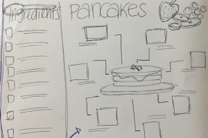
1) This first idea I had was to create a visual in the centre and put the process around this visual. With the infographic being about how to make pancakes the obvious choice for the centre image was a stack of pancakes. This tells the viewer at a glance what the subject of the infographic is. I like this idea but would still have to develop it a bit more.
2) I used the same idea of the stack of pancakes in the centre, however placed the ingredients on the left side of the infographic and placing the steps slightly differently around the main image. I think if I were to go with this sort of layout it will need a lot of work and I don’t think the steps set out this way is as effective in showing a process. I may scratch this option when deciding upon a final layout.

3) In this idea I decided to base the whole process inside the image of the stack of pancakes. I want to make the baker’s hat much larger for the ingredients, though not as large as the pancake stack as I don’t want it to detract from the main message. I think there is an adequate use of whitespace but I’m still unsure exactly how to place the images for each step in each pancake. I will work on how to do this once I decide on what layout I will refine. I think this idea could work out nicely.
4) I followed a basic step-by-step layout in this idea, using the rule of thirds. I feel as though the ingredients are squashed up at the top and would definitely need to find another way to display this information if I were to use this layout as a starting point. Like the last idea I feel as though there is a good amount of whitespace used here however I don’t know whether the baker’s hat is the right main image compared to the stack of pancakes…

I really like all of them! Especially the first one! You really are showing a step-by-step process now which covers a significant part of the brief! Just be careful though not to use too much typography, you want your image to speak as words in some cases. But obviously it is up to you what your text to image ratio is 🙂
LikeLike
These are all some pretty solid ideas. I like them all.
Visually, the most appealing to me are the 1st and the 3rd ones. The 1st is easy on the eyes and even easier to follow. The use of images is also rather fun. That said, I like the 3rd much better. If you sort out the rule of 3rds to a much better degree, then I think that the 3rd could be your strongest infographic idea.
As it stands though, putting all your eggs into the basket of the 1st one wouldn’t be too bad. You’d definitely get the grade if you pull it off. Overall, I’m intrigued to see how this pans out in the future.
You’re surprisingly good at drawing pancakes, by the way.
LikeLike
What a cool idea for an infographic! My favorite concept is the third one with the instructions inside the stack of pancakes. I think it is really clever putting the ingredients inside the hat at the top, almost like a traditional recipe layout but more interesting! However I wonder if you really need the arrows pointing to each next step? I understand their use in your other concepts, to guide the viewer around the steps, however I think the fact that concept 3 uses the stack of pancakes ranked from top to bottom speaks for itself and is easy enough to follow without arrows. If you wanted to, you could number the steps instead in a more discrete way? I think the arrows clutter the image a little. All of your concepts look great though, the essential elements are all there and I can image a nice warm, foody colour scheme going along with it well =D
LikeLike
I really like your third idea because it flows nicely and is easy to read from top to bottom. You might want to be careful though that it doesn’t get too wordy – perhaps leave out the ingredients list at the top and integrate it through out the ‘steps’?
LikeLike
Hey Loretta! Firstly, these plans are all amazing. They all have a clear structure and composition and I feel anyone would be able to understand the main process of pancake making from looking at any of them. My favourites are probably your first and third plans. I like how the first one has the image of pancakes in the middle with clear steps surrounding it. The third one is really creative and also shows the clear steps in the pancake stack. However I would be careful not to make your final image too busy with heaps of typography- let your symbols speak for themselves! 🙂 I’m looking forward to seeing your final infographic!
LikeLike
I really like your first concept, compared to your other ones. The arrows really help in the natural eye movement and the whole image has elements that fit really well. If you do go for any of the other concepts, do make sure that the typography fits well with the other elements and creates a natural eye movement, just as well as the first concept. Other than that, I think this is solid work!
LikeLike