Effective examples:
Source: https://creativemarket.com/blog/2014/07/01/create-your-own-infographics-with-these-65-templates
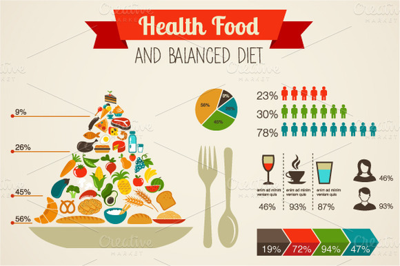
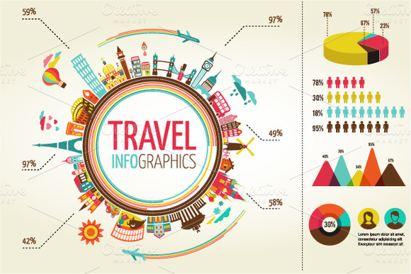
I think both of these examples are very effective at presenting information. They are a great inspiration to what I’m trying to achieve.
The use of similar shades and complimentary colours really makes these infographics ‘pop’ and instantly attracts the viewer.
I definitely think that these examples have done well in creating a focus with the pyramid and circle/world shapes. This shows the viewer what the infographic is about. These are well balanced with the more in depth smaller statistics on the right hand side of the graphics. The composition and whitespace has been used well to not clutter the overall infographic.
There is not much type however each aspect is communicated in a way that people will understand what the statistics mean. There also may be a key to go with these infographics to match up the colourings of the images. This is an idea that I may use; colour coding my pancakes to certain steps on the side for example. I feel like it could make what I’m wanting to achieve easier as fitting the image INSIDE each pancake may make the images smaller and insignificant. I am still looking into this idea.
I also want to add that I like the illustration style in these infographics and would like to experiment with this once I start in illustrator and am done with all this planning!
I think that these infographics are both equally detailed and simplified so that it visually communicates it’s intended message with one look, yet in an interesting, unique way. This is something I aim to do with my inforgraphic.


Good research Loretta, seems very focussed and helpful for you trying to plan out your infographic. I really like how you identified a positive thing from this research in that they identify the target audience. Maybe some feedback to go about your research even more would be to survey a more vast form of infographics to get an even larger scope of ideas?
LikeLike